In 2025 the 3seven brand was created in order to see firsthand how a brand was built from scratch.
Here is the journey...
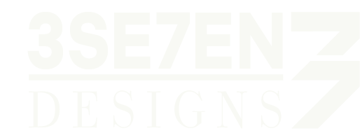
...Initially starting out as 3se7en Designs, the initial concept was to develop a brand that creates both a creative narrative underpinned by a professional tone. This was to ensure the ability to attract clients from both the professional/corporate sector and bespoke/artisanal sector.
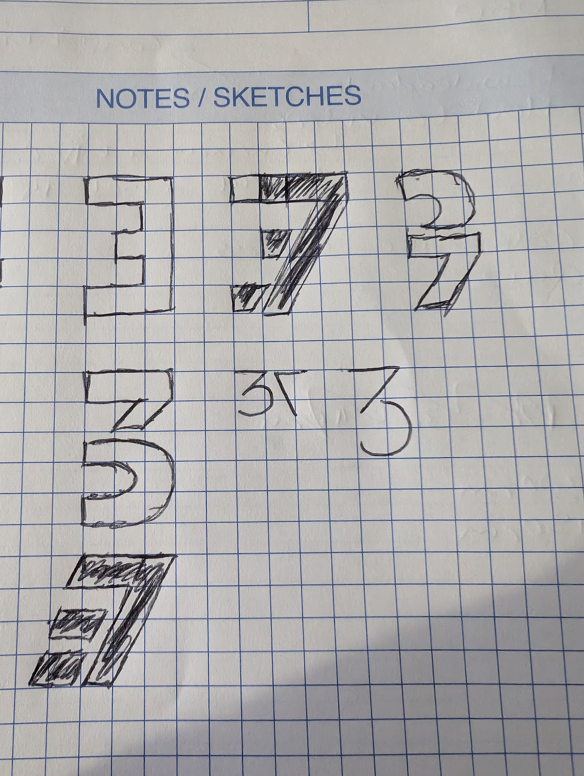
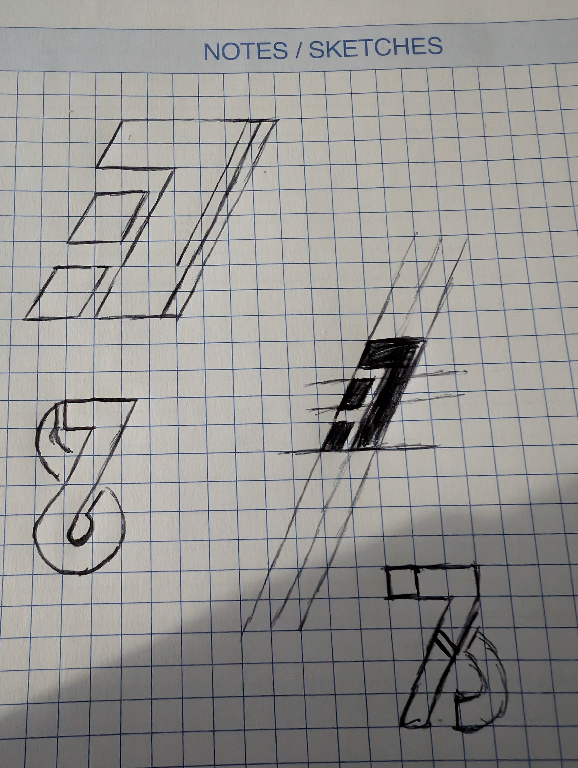
From here an effective logotype and icon was developed. Creating an established icon would allow the brand to be built around the logotype. Here numerous rough sketches where created in order to identify the look and feel of the logo icon and create a foundation to be built upon.
Following these sketches an initial concept was created using a sans serif font.

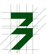
In order to define the icon the concept was redesigned to create more harmony between the 3 and 7 being shown.
3se7en logo icon
3Se7en design concept
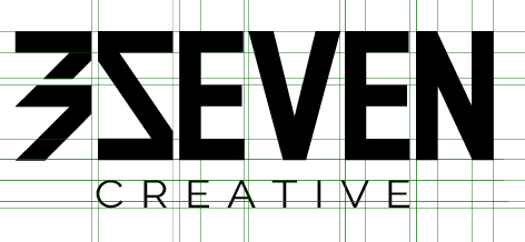
As the brand is to be focused on digital design and creativity the logotype needed to reflect this. As such a custom font was created based off of the 'indivisible' font. With the idea of creativity being at the forefront the term 'designs' was replaced with 'creative'.

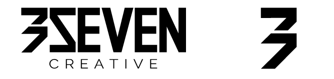
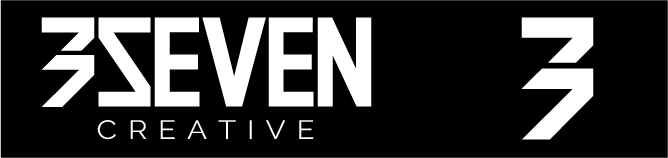
Following feedback from colleagues and peers, it was identified that this design, while displaying the 37 within the logotype comes across as 'busy' and illegible. Taking this into consideration, the design was stripped back with the final logotype being created in monochrome to identify the usability of the logotype.
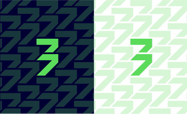
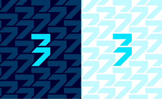
To bring the brand to life a simple yet accessible colour palette was chosen. As mentioned previously the brand required a digital aspect yet still needed to be accessible aligning to WCAG 2.1 AA standards and as such, taking a retro-digital approach the colours to represent the old 'teletext' digital era when interactive TV first appeared where used.
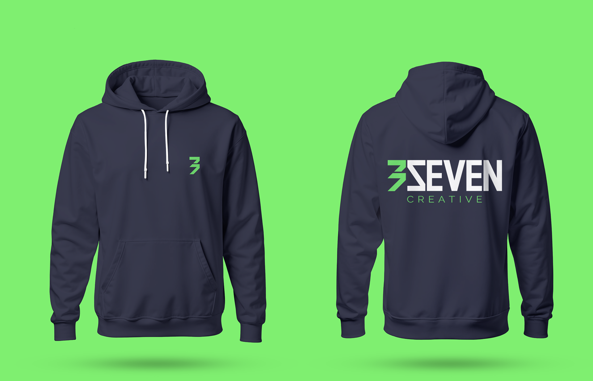
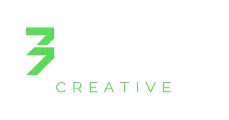
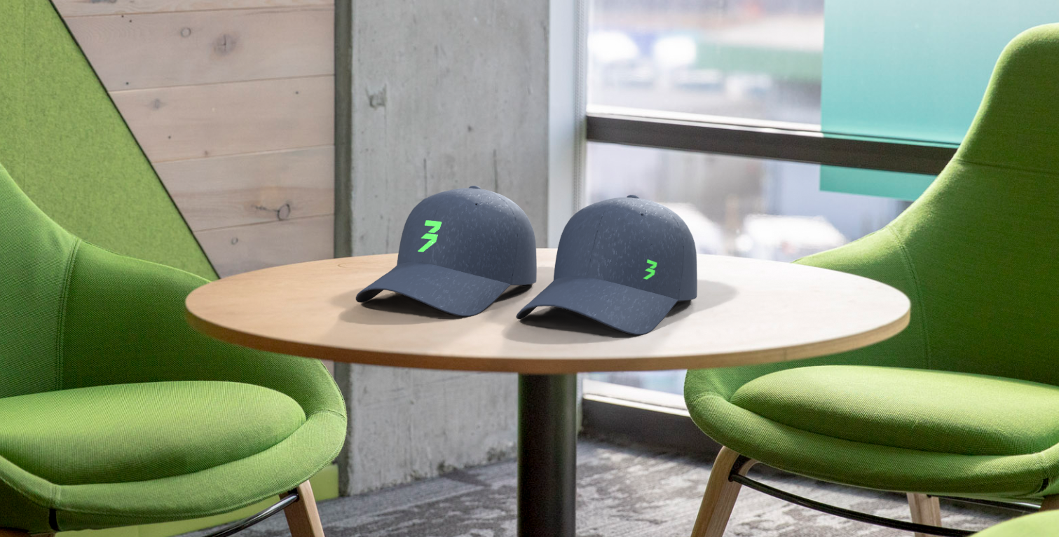
Here is the final brand design....
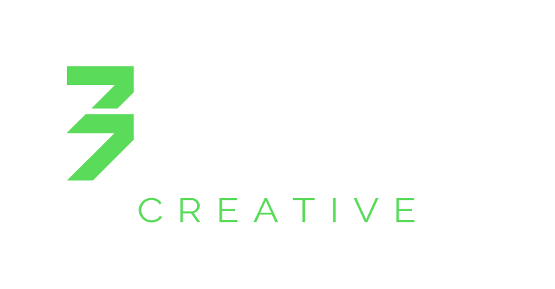
3seven standard logotype
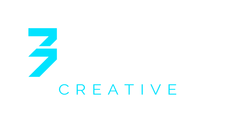
3seven digital learning logotype